Category Archives: bullshit

Going native.

“Native advertising”—what we used to call advertorials in the world of dead-tree media—are having a moment, and part of me hopes it doesn’t last much longer than that.

It’s somewhat impolitic of me to say that in a public (if lightly trafficked) forum, since my agency, like most others, is dabbling in the medium for some of our clients.

The premise is simple enough: disguise the fact that your ad is an ad, make it mimic the editorial format it’s placed in, and readers will lower their guard and be more receptive to your message. People consume media for its content, right? Ads are something to be endured, ignored or skipped. Make your ad look like editorial content and people will engage.

Well, maybe.

Since this blog exists in a data-free zone, I can’t verify one way or another if this ploy works in digital media. I know, or think I know, it doesn’t work very well in print, even though you see it all the time, especially in lifestyle publications. Usually it’s what is absurdly termed a “value added” media buy: put an ad in our rag,  and we’ll put some pseudo-editorial focusing on your brand nearby.

In practice, what happens is either a) low-level creatives at the agency are assigned the advertorial, which does nothing for their portfolio and which calls for journalistic skills they likely don’t have; or b) the publication assigns its own hacks, who do an equally execrable job. To make it worse, all this ad-plus-editorial crap is usually segregated in its own free-standing section within the mag, making it that much easier to skip the whole thing. Advertisers still do it, because it feels like getting something for nothing, but most people I know just ignore this stuff, and are under no delusions about what it is.

But what about digital?

Well, the nature of the medium is such that, frankly, it’s easier to disguise your paid-media identity. Aggregating sites like Buzzfeed and Huffington Post are very busy visually, and it creates ripe opportunities for subterfuge. Here’s one example, from Buzzfeed:

Screen Shot 2014-04-03 at 4.21.44 PM


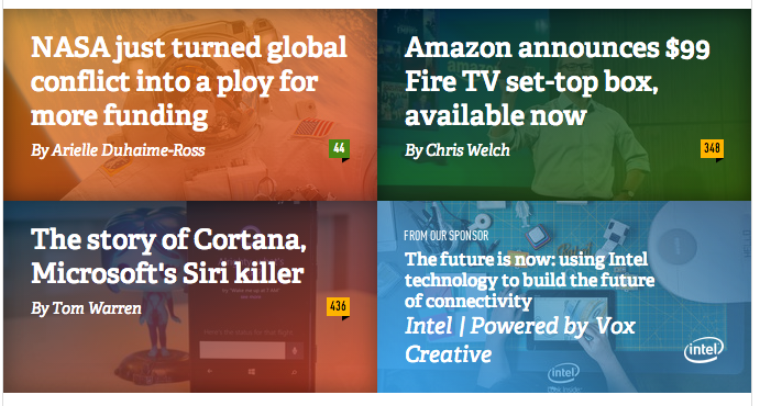
Man, you gotta look real hard to realize there’s a wolf among those sheep. That Intel…thing in the lower right looks pretty legit. And I’m guessing it got a lot of clicks. But to what end? No one likes getting played for a sucker, and clicking on what you think is a tech article and winding up looking at some bogus Intel corporate “content”—how does that build brand loyalty?

Nowhere in this screed have I even touched the ethics of all this, because advertising people talking about ethics is like 1-percenters talking about food stamps. But still, let’s be clear: native advertising is, by its nature, disingenuous–the Devil in disguise.

And while ads–real ads– aren’t always as truthful as they could be, they make no attempt to be anything but what they are: an exercise in selling, a tool of commerce. People know an ad when they see it, and whether they pay attention or not has to do with whether they care about what’s being sold and the craft of the message itself. That, ultimately, is something I believe in my bones: that good ads go naked into the world, armed with nothing but words and pictures, and, faced with indifference and scorn, somehow prevail.

Tagged , ,

I want Nate Silver testing my ads.

Where have I been for the last 6 months?

Refreshing Nate Silver’s fivethirtyeight blog ten times a day, like a rat hitting the treadle for morphine. Silver’s last electoral map projections are still up on his site: 50 for 50. He’s left it up like a war trophy—a scalp. And the scalped head in question is most likely Gallup’s. Silver has been beating Gallup like a rented mule all election season, and with good reason: it blew the last two election cycles badly and was a major Romney-leaning outlier all the way to the end this time.

“It was one of the best-known polling firms, however, that had among the worst results. In late October, Gallup consistently showed Mr. Romney ahead by about six percentage points among likely voters, far different from the average of other surveys. Gallup’s final poll of the election, which had Mr. Romney up by one point, was slightly better, but still identified the wrong winner in the election. Gallup has now had three poor elections in a row. In 2008, their polls overestimated Mr. Obama’s performance, while in 2010, they overestimated how well Republicans would do in the race for the United States House.”

Why has Gallup been getting it wrong? Like Mr. Romney and his party, it’s a bit stuck in the 50s, depending on land-line phones for its polling.  “Research by polling firms and academic groups suggests that polls that fail to call cellphones may underestimate the performance of Democratic candidates.

The roughly one-third of Americans who rely exclusively on cellphones tend to be younger, more urban, worse off financially and more likely to be black or Hispanic than the broader group of voters, all characteristics that correlate with Democratic voting.”

Well, duh.

But there are laws restricting access to cell numbers and the ability to make unsolicited calls. So what is a polling outfit to do? The big winners  this year were the research firms

who depended partly or entirely on online polling, which is where most Americans do their fact-finding and opining.

The stunning obviousness of this methodological flaw is

matched only by the glacial slowness with which traditional research firms are changing to adapt.

All of which got me to thinking about advertising research, which in 2012 is still rounding up the usual underemployed or retired suspects, sticking them in conference rooms with 2-way mirrors and showing them animatics or “adlobs.” It is as stuck in the 50s as Gallup, which itself had its roots in advertising research, and the reliability of the results is just as suspect.

If the triumph of Nate Silver teaches us anything, it’s that good data isn’t about the answers people give. It’s about who is giving the answers, and who’s asking the questions.


No one here but us old white people.

Tagged , , , ,

Just when you thought it was safe to work on P&G

P&G Finds Orange Ads Work Better on Facebook | Digital – Advertising Age.

Four down. Only 23 to go!

When the Weiden & Kennedy Old Spice campaign hit, it was a bittersweet moment for me. I worked on Procter business for almost 15 years, during the dark ages when they called advertising “copy” and storyboards lived or died on a day-after-recall test score. I had already moved on to other clients (and different kinds of problems) when P&G started to evolve creatively over the last few years–going to Cannes, freshening up their agency roster, doing better, simpler, more visually oriented work. Then the Old Spice Man happened and I could taste the green bile of envy in my mouth: If only P&G was this open-minded back when I worked on the business…

Well, maybe not so much. Companies, like people, revert to type over time. In Procter’s case, that means the overpowering desire to turn creative into a quantitatively-driven, repeatable, predictable process. In my day, that meant dealing with canards like “You need to mention the brand name 4 times during the 3o seconds, and within 4 seconds from the beginning.” Now, thanks to the continuous feedback loop which is the internet, it’s much, much, more granular:

“For about a year, Pantene has been using such a system, Smart Media, developed with Resource Interactive, Cincinnati. Smart Media analyzes click-through rates and flash surveys on purchase intent across numerous permutations of ads and placements.

The program evaluates three creative elements (the headline, hair visual and background color), and Pantene makes changes based on how different combinations of each element perform in various media placements.

The brand makes discoveries that inform future creative. Those have included that white backgrounds don’t work well on Yahoo, orange is effective on Facebook and blondes get a better response than brunettes on some sites.”

Personally, I’d rather stick knitting needles in my eyes than face a future of letting every single variable in an ad I create be “optimized” in this way. But that doesn’t make me right. It makes me, at this point in my career, someone with the luxury of choice. Procter is seeing gains in all their metrics by following this methodology, and I have no reason to doubt it. Google, everyone’s favorite cool tech company besides Apple, does everything this way. Every word, every color, every pixel of white space in a Google interface has been “designed” by sheer computational force. While I doubt that is true of their wonderful advertising yet (because if it did, I’d have to kill myself), give it time.

Meanwhile, if you’re a youngish creative with a headhunter texting you about a great job working on P&G at Publicis, think about this: 1 banner ad with 3 different headline options, 3 different background colors and 3 different head shots=27 layouts.

Have fun.

Tagged , , ,

A challenging day.

Humankind cannot bear too much reality.”
–T.S. Eliot, “Burnt Norton”

It’s been a challenging day.

The weather has been challenging, the fraudulent use of my credit card in Madrid is a challenge, and my painting contractor’s sudden, unexplained disappearance will certainly pose a challenge going forward.

My 3rd quarter mutual fund letters to shareholders make abundant use of the word “challenging,” as do CEOs reporting missed targets on analyst calls. Having all their franchise players injured was certainly a challenge for the Mets.

The beauty of “challenging”, as opposed to, say, “totally and completely fucked,” is that challenge is noble and invites rising, whereas total and complete fucked-upness is depressing and invites sitting down or–even better–going to sleep.

Euphemisms have their place in civilized life. They grace the skids for little white lies meant as a kindness, and they minimize the gross factor in discussions about bodily functions. But I’ve never understood euphemisms that mask truths, fool no one, and leave neither speaker or listener feeling better.