Category Archives: Uncategorized

Brands to Super Bowl: Thank you for a crappy game.

d44f4c05eaafff0286ea1cb62b8f64cbEvery commercial in the Super Bowl was better than any thirty or 60 seconds of the game or the halftime show.

And for that, the advertisers who bought time during the broadcast should be grateful. Because a whole slew of ads that in other years would have sent viewers off to get more guac or take a bathroom break became magically entertaining vs. the 3-and-outs on the field.

My own metric of “best” and “worst” spots is different than the USA Today polls and other audience polls. Because I grade on a curve: the shittier the brief, the more tolerant I am of bad execution.

Mercedes’ spot for voice-activated controls on its new C class, for example, had the kind of brief creatives dread: make a big deal about a feature that’s, well, not a big deal. So they came up with a time-worn trope: if only everything in the world worked like _________, the blank being your product feature goes here. But they get a pass (the escaping Orca helped), because the brief sucked.

But the team working on the Washington Post spot had the dream brief of all time: defend the importance of journalism in these perilous post-factual times. I mean, I’d kill for that brief. And what did they run? Essentially, a rip-o-matic. Yes, Tom Hanks did the VO but it’s not like they gave him a lot to work with. Disappointing.

Also on the wrong end of the grading curve is Olay’s fright-film homage with Sarah Michelle Gellar. Why? Because buried underneath a lot of superfluous dialogue and jumpy editing is an absolutely brilliant product-driven idea: Olay works so well, your phone’s face-recognition technology won’t unlock the phone so you can call 911. This is pure conceptual gold, and in more deft hands would have been a lock for a Cannes Lion. Over complicated and over-produced, it’s an enormous missed opportunity.

Amazon’s Alexa spot and the two Google spots are a study in contrast. Amazon, for reasons that elude me, decided to visualize everyone’s worst fears about AI-empowered personal tech, updating the Frankenstein/Golem trope with Alexa-equipped dog collars, hot tubs and space stations ruining our lives. Super-nerdy footnote: Harrison Ford, himself a self-aware robot in Blade Runner, being terrorized by his tech-enabled dog. Google, on the other hand, follows the winning playbook they used for their beautiful “Paris” Super Bowl spot of a few years back: tell a heartwarming human story and show how Google technology plays a helpful part. Clear idea, good craft, and Google’s role right-sized and authentic.

Pepsi/T-Mobile/Expensify/Sprint/Bud Light/…don’t ask me because I’m not the target and my grumpy-old-man opinion is irrelevant. But while I think the whole Dilly Dilly thing is stupid, I’m at least grateful to Bud Light, HBO and their agencies for truly and completely surprising me with the GOT ending. Way more exciting than watching the Rams punt.
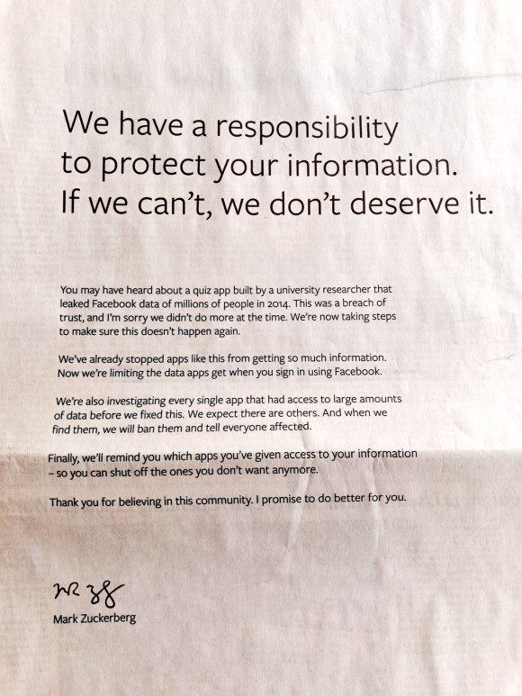
Take this ad and ship it.

Attachment-1

I’ve done enough corporate we-really-are-nice-guys ads in my life to know a non-apology when I see one. 

This ad checks all the boxes of corporate humility except one. There’s the no-frills art direction. The modest little logo in the lower left. The snowy-white negative space. The “personal” flourish of Zuck’s signature. The plain-spoken, Riney-esque syntax. 

Everything a mea culpa ad should have, except for one thing: the magic words “I’m sorry.” Zuckerberg does say “…I’m sorry we didn’t do more at the time.” That’s some lawyered-up bullshit. Anytime you hear someone in the public eye say something with the words “at that time” that’s a lawyer talking. “I’m sorry.” needs to be its own sentence, without qualifiers and without hedges. 

“I’m sorry.” The magic words that open ears and soften hearts. They’re not in this ad because Mark Zuckerberg is not sorry. What’s more, he’s not sorry that he’s not sorry because you and I are not his customers. We are the product. And products don’t get apologies.

They get sold.

Trump’s hiring practices explained.

rs-18794-20140502-sopranos-x1800-1399058455

For a man prone to superlatives, Donald Trump sure seems comfortable with mediocrity in his key appointments. I’m not talking about ideology here. I’m talking about competence and experience. There are plenty of whip-smart hard-right conservatives who know their way around government.

But Trump surrounds himself with nincompoops, neophytes, family members and sycophantic retainers. Jared Kushner is in charge of everything but the White House kitchen. Ivanka meets with world leaders. Spicey, who admittedly has a crap job, is terrible at it. Bannon is by all accounts smart, but otherwise looks and acts like a homeless person. Then there’s Manafort, Burwell, Roger Stone, Boris Shteyngart, Omarosa….why?

The answer we’d like to believe is that better-qualified people have too much honor and self-respect to work for Donald Trump.

Don’t believe it.

When the President of the United States, even Cheeto Jesus, asks you to join his team, and if his policy views even mildly overlap with yours, it’s very tough to say no. Trump could have had an inner circle that was seasoned, informed and good at their job.

I think the simpler, and therefore more likely to be correct, answer is because Donald is bent. And bent people need other bent people who won’t rat them out and won’t have moral qualms about doing more bent stuff.

Neither the corporate world nor even the government fits this paradigm well. Instead, look at the Sopranos: a wily, blustery capo surrounded by wackos and hangers-on, and a family that chooses to ignore Tony’s criminal behavior because they like the BMWs and bling. They’re all complicit, they’re all at risk–which makes them loyal in a way an untainted person could never be.

Viewed this way, Trump’s HR strategy makes more sense. The innermost circle is family (including Jared, son of a felon). The next ring out is the bent brigade, many of whom could easily wind up doing a perp walk for everything from perjury to working for a foreign government to money laundering to fraud. They’re all in this together, thick as the proverbial thieves.

Big Pussy? Chris Christie. Silvio, with that pompadour? Bannon. Christopher? Jared. Omarosa? KellyAnn. See? It all fits. Feel free to fill out the rest of the cast before they start stamping out license plates.


Tagged , , , , , , , , , ,

Odd couples.

I’ve been a Wired reader since Issue 1. Back in the day, it was not only interesting, it was beautiful, with typography, art direction and production (6-color printing!) that kicked ass.

Today, Wired is still a geekfest, if more mundane looking, and also chock-full of ads in categories I can relate to, which, I guess, is the whole point of media planning.

But anyway. The following ads were all in the May issue, pages apart, which allowed my mind to group them into amusing pairings. Here’s one pair:

wired002

wired001


The Viagra ad is what it is: a legal necessity, and an ad in name only. For those paying attention, and we won’t go into why, the background is an image from one of the blue-on-blue TV spots. It hardly matters, given the copy mandatories plastered over every square inch.

But when the new E-Trade ad showed up a few pages later, it got me thinking. About how much I miss the baby, for one thing. About how “Type E” could actually be the premise of something good, except that didn’t happen. But mostly I thought, some agency made this ad look like a pharma fair-balance ad by choice-not because the FDA forced them, but because they thought it was a good idea. Does E stand for Erectile?

Here’s another pair:

wired004

wired003


Talk about a study in contrasts! We all want to be (or at least feel like) the blissed-out dude in the Virgin America ad. They took a minor amenity—a complimentary glass of bubbly—and turned it into a visually arresting, amusing ad.

Now consider the KLM ad. They should have had an easier time of it. After all, they were advertising business class, not a tricked-up version of steerage. Yet the ad is a study in depression. A white guy is curled into a fetal ball, making his lie-flat bed look cramped and unforgiving. Next to him, another white guy stares out at the dull Dutch landscape below. Between them, an odd metal divider that appears to be riddled with bullet holes. People! You are the country of kick-ass weed and Vincent Van Gogh! Loosen up!

Tagged , , , ,

What doesn’t kill you makes you stronger.

I feel for the parents of kids with severe peanut allergies.  For reasons no one seems to understand, this once-rare condition is now pretty common. So common, even the saintliest package of locally sourced, cruelty -free kale wafers has to confess on its package that it was made in a plant that processes peanuts. A co-worker tells me peanuts are banned outright at her kids’ school.

Watching their product become the food world’s equivalent to arsenic can’t be much fun for America’s peanut farmers. Coming up with a new campaign to promote peanuts could not have been much fun for the creative team, either, since you can’t acknowledge the  800-lb. legume in the room.

Hence the weirdly context-free new Peanut Board campaign:

national-peanut-board-3-600

This is pretty innocuous, even with the word “Powerful” in the headline.

I saw this ad on a commuter train, so I had plenty of time to do what I do way too much: make up snarky, immature alternate headlines. I’m not proud that I do this–it just comes over me, like a sneeze. How about…

Peanuts. There’s an Epi Pen in every bag!”

Or my favorite:

“Allergic to peanuts? More for us!”


AArrrrrgghhh

american-airlines-logo-change_4

American Airlines: Why? Why? For God’s sake, why?

Didn’t you learn from Tropicana?

Or the new University of California logo fail?

Your Massimo Vignelli-designed logo and livery were beautiful. Planes glinting with their polished aluminum skins hinted at the glory days of aviation and were instantly recognizable.

The linked “A” logo with its stylized eagle was perfect.

imgres-1

What is that new logo? A squeegee?

And the tail livery! It looks like a lint comb.

Apparently one of the drivers for this desecrationrefresh was that the new 787, some of which are on order for American, was made of plastic so it couldn’t rock the polished-metal look. How’s that working out so far?

Tagged , , ,

I want Nate Silver testing my ads.

Where have I been for the last 6 months?

Refreshing Nate Silver’s fivethirtyeight blog ten times a day, like a rat hitting the treadle for morphine. Silver’s last electoral map projections are still up on his site: 50 for 50. He’s left it up like a war trophy—a scalp. And the scalped head in question is most likely Gallup’s. Silver has been beating Gallup like a rented mule all election season, and with good reason: it blew the last two election cycles badly and was a major Romney-leaning outlier all the way to the end this time.

“It was one of the best-known polling firms, however, that had among the worst results. In late October, Gallup consistently showed Mr. Romney ahead by about six percentage points among likely voters, far different from the average of other surveys. Gallup’s final poll of the election, which had Mr. Romney up by one point, was slightly better, but still identified the wrong winner in the election. Gallup has now had three poor elections in a row. In 2008, their polls overestimated Mr. Obama’s performance, while in 2010, they overestimated how well Republicans would do in the race for the United States House.”

Why has Gallup been getting it wrong? Like Mr. Romney and his party, it’s a bit stuck in the 50s, depending on land-line phones for its polling.  “Research by polling firms and academic groups suggests that polls that fail to call cellphones may underestimate the performance of Democratic candidates.

The roughly one-third of Americans who rely exclusively on cellphones tend to be younger, more urban, worse off financially and more likely to be black or Hispanic than the broader group of voters, all characteristics that correlate with Democratic voting.”

Well, duh.

But there are laws restricting access to cell numbers and the ability to make unsolicited calls. So what is a polling outfit to do? The big winners  this year were the research firms

who depended partly or entirely on online polling, which is where most Americans do their fact-finding and opining.

The stunning obviousness of this methodological flaw is

matched only by the glacial slowness with which traditional research firms are changing to adapt.

All of which got me to thinking about advertising research, which in 2012 is still rounding up the usual underemployed or retired suspects, sticking them in conference rooms with 2-way mirrors and showing them animatics or “adlobs.” It is as stuck in the 50s as Gallup, which itself had its roots in advertising research, and the reliability of the results is just as suspect.

If the triumph of Nate Silver teaches us anything, it’s that good data isn’t about the answers people give. It’s about who is giving the answers, and who’s asking the questions.


No one here but us old white people.

Tagged , , , ,

You can judge a book by its cover. Unless it’s the digital edition.

A story:

It’s 1955. A carpenter is wrapping up construction of a beautiful new staircase and bannister for a homeowner. The homeowner comes by, admires the carpenter’s handiwork, and then asks him a question: “Hey, Joe, do you know any electricians who know how to install those new TV antenna thingys up on the roof? My wife’s been after me to put one of those things up there and connect it to the new television console we just bought.”

The carpenter says, “Sure. Why don’t I have him drop by tomorrow?”

The next day, the doorbell rings and the homeowner opens the door to find this same carpenter, now outfitted with a ladder, electrical tape and wire cutters rather than saw and drill. “I thought you said you were sending someonewho knows about TV antennas,” the homeowner, confused and slightly irritated, said. The carpenter, who had spent years clambering around roofs, attaching everything from weathervanes to cupolas to (more recently) TV antennas, said to the homeowner: “I did.”

The homeowner looked at the tradesman’s truck parked in his driveway with the words “Joe’s Carpentry” emblazoned on the sides. “Sorry Joe,” the homeowner says. “You’re a great carpenter. But I need an antenna expert here.”


Change the date to 2012, change the new technology to digital advertising and/or social media, change the homeowner into a client, and welcome to the world of full-service advertising agencies.

Clients, desiring to take advantage of a new medium but too unsure of themselves and this unfamiliar new world to judge the actual work or the expertise behind it, are looking out at their metaphorical driveways to see if the word “Digital” (or 2.0, or X or something that sounds like a sixties band, like Virtual Noise) is painted on our metaphorical trucks.

Agencies, who know damn well that an idea is an idea is an idea, and that you craft the idea to be appropriate to the medium it’s in, are trapped. If they point this out to the client, they look defensive. If they don’t, they’re playing in the digital agency’s house. Either way, they lose. And clients lose, too, because any possibility of truly integrated work goes away when the traditional agency and Virtual Noise 2.0 split the account.

This is not to suggest in any way that clients are to blame. Let’s say, to take the homeowner metaphor into the present, you want to go off the grid and convert your home to solar electric power. So you’re the client. Who are you going to use to do the installation–Joe’s Electric who has been your go-to guy for putting in  new outlets and lighting fixtures–or SunStrong, whose motto (printed on all their solar-power trucks) is: “The Next Generation of Power Generation”?

Exactly.

Provenance counts.

Provenance counts in buying art and antiques because the product’s expensive and you’re afraid of being bamboozled. That’s why Gagosian, Christies et. al stay in business.

Provenance counts in buying healthcare because the stakes are so high and the subject matter is so beyond your grasp. So seeing the words New York Presbyterian or Mayo on a surgeon’s lapel pocket are very reassuring.

And provenance has always counted in advertising, where David Ogilvy has won more accounts taking a dirt nap than the rest of us have wide awake and pumped up on Red Bull, fear or other stimulant of choice.

But now it counts more than ever, trumping common sense, experience and trust.

These things have a way of working themselves out over time. No one has wondered for a very long time, as Procter & Gamble must have in the early 50s, whether their ad agencies, grounded in print, radio and outdoor posters, could make ads for TV as well.

And the day will come–trust me on this–when brands will be able to sample their wares via a texted code to unlock the customer’s 3-D printer or makerbot. When that day comes, the words “Digital Branding Strategists” on the business card won’t look so hot anymore.

Silly wabbit. Virtual is so 2012.

Tagged , ,

The Suckage Matrix

Watching cable channels like Bravo and TBS means being treated to a crazy mishmash of expensive national spots and low-rent local ads in every commercial break pod.

Glossy effects-rich corporate anthems alternate with messages from local nail spas and rug stores shot on a Flip and edited on iMovie. Aspect ratios stretch and shrink like cheap suits: too wide, too narrow, not enough letterbox or too much.

It’s entertaining the way a good downtown street is entertaining: bodegas and chic restaurants, hardware stores and glam boutiques are all in the mix.

But this collision of high and low commerce also underscores the sad fact that budget doesn’t correlate to goodness. Let’s construct a suckage matrix:

The Suckage Matrix

The best place to be, of course, is in the upper-right quadrant: great advertising that costs virtually nothing to make. Google’s Parisian Love spot is a fine example.

The upper-left quadrant, bad advertising that was made on the cheap, isn’t fun to watch (or produce) but it’s not a surprise and—viewed strictly as a business decision– it’s not a disgrace. If it works, great; if not, no biggie.

Good advertising that costs a lot of money to make–the lower right quadrant– is simply what one would expect when you give a lot of creative talent the resources to realize their idea.  BBDO built a global agency almost entirely in this quadrant: making pretty good and occasionally terrific big-budget TV spots for Fedex, GE and Pepsi.

And then there’s the death quadrant: bad advertising that cost a fortune to make. You see less of it than you used to, partly because no one has any money and partly because of the internet. But occasionally you see something that just takes your breath away as you watch millions of dollars go up in sooty, stinky smoke.

Such is the new TransAmerica campaign. If you haven’t seen it, please, please do. I can’t really do justice to all its expensive, CGI suckage.  It includes humongous gears, a conveniently deceased husband, a yellow cottage and something about pyramids. Oh—and a girl who sings a treacly bit of “Tomorrow” from the musical “Annie.” Really.

To understand how something like this could get conceived, let alone presented, sold, produced and aired, it’s instructive to read the Adweek puff piece that ran the week the campaign debuted.

The underlying theme of the article is that life insurance is really fucking boring and so the agency creatives had to challenge themselves to find a way to make it less boring. Translation: “This shit doesn’t interest us because we’re 32 years old and we’re going to live forever. But really big gears could be cool.”

Exactly. But that still leaves the question of how on earth JWT sold this nonsense to the client. The answer lies in this bit of helpful reportage: “Each ad uses special effects to literally get under the roof of Transamerica’s iconic ‘Pyramid’ building in San Francisco…”

In other words, the agency convinced the client these ads “leveraged his brand equity.” Except for one thing:

You don’t know you’re in the “Pyramid” building because the pyramid doesn’t appear until the last 2 seconds.

 So this entire hellish life-as-a-giant-factory-assembly-line metaphor unfolds with zero context and zero explanation.  Makes the eyebrow-threading spot that followed it that night look pretty, pretty good.

You say goodbye. I say hello.

The Thursday before Memorial Day weekend one set of doors closed and another set opened. Phone and internet carried over with nary a hiccup, no deadlines were missed, no clients inconvenienced.

Right now the new space still feels tingly and unexplored, more possibility than reality. I know familiarity and comfort will come. I hope they don’t come too soon.