I’ve been a Wired reader since Issue 1. Back in the day, it was not only interesting, it was beautiful, with typography, art direction and production (6-color printing!) that kicked ass.
Today, Wired is still a geekfest, if more mundane looking, and also chock-full of ads in categories I can relate to, which, I guess, is the whole point of media planning.
But anyway. The following ads were all in the May issue, pages apart, which allowed my mind to group them into amusing pairings. Here’s one pair:
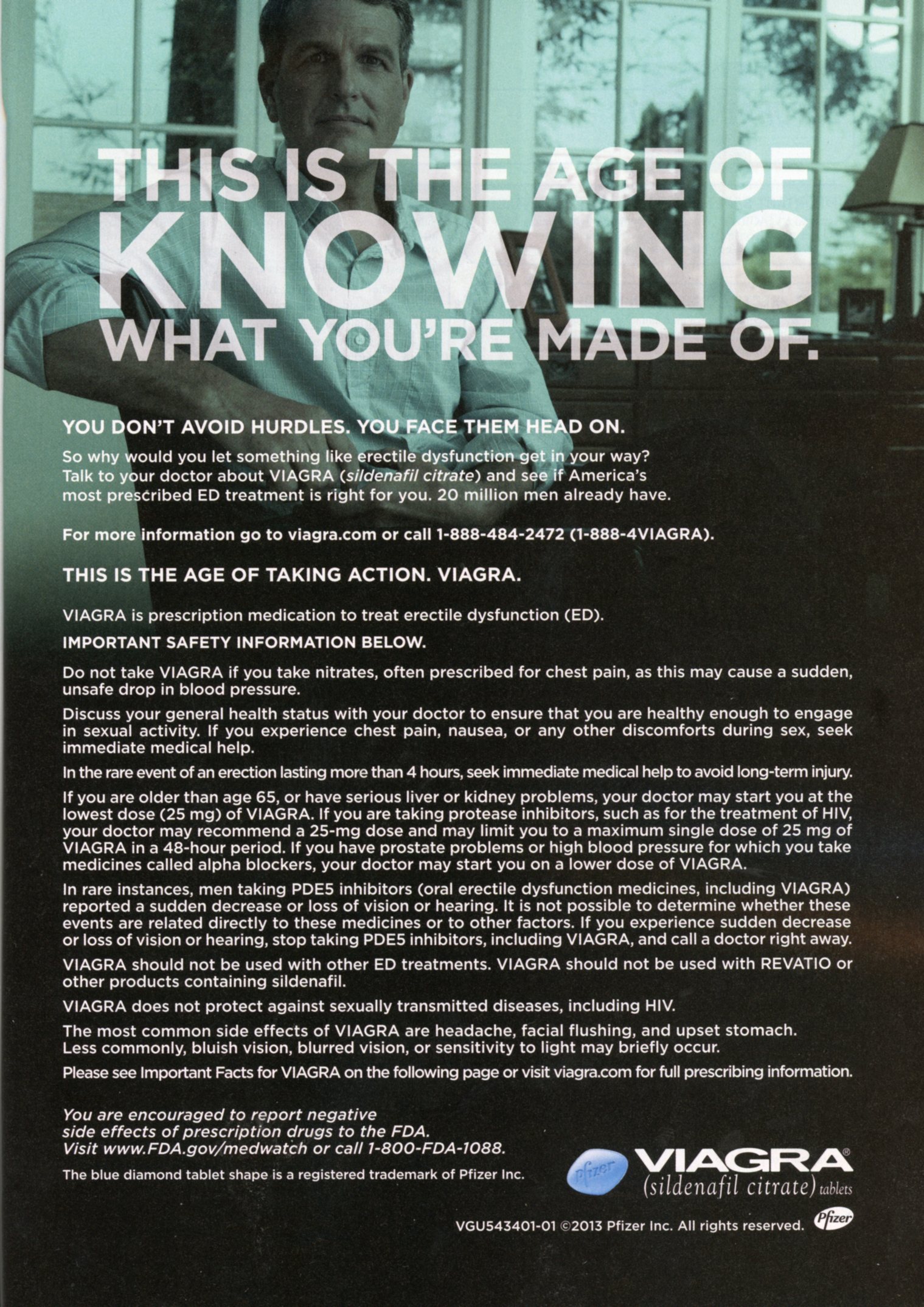

The Viagra ad is what it is: a legal necessity, and an ad in name only. For those paying attention, and we won’t go into why, the background is an image from one of the blue-on-blue TV spots. It hardly matters, given the copy mandatories plastered over every square inch.
But when the new E-Trade ad showed up a few pages later, it got me thinking. About how much I miss the baby, for one thing. About how “Type E” could actually be the premise of something good, except that didn’t happen. But mostly I thought, some agency made this ad look like a pharma fair-balance ad by choice-not because the FDA forced them, but because they thought it was a good idea. Does E stand for Erectile?
Here’s another pair:


Talk about a study in contrasts! We all want to be (or at least feel like) the blissed-out dude in the Virgin America ad. They took a minor amenity—a complimentary glass of bubbly—and turned it into a visually arresting, amusing ad.
Now consider the KLM ad. They should have had an easier time of it. After all, they were advertising business class, not a tricked-up version of steerage. Yet the ad is a study in depression. A white guy is curled into a fetal ball, making his lie-flat bed look cramped and unforgiving. Next to him, another white guy stares out at the dull Dutch landscape below. Between them, an odd metal divider that appears to be riddled with bullet holes. People! You are the country of kick-ass weed and Vincent Van Gogh! Loosen up!