Category Archives: typography

These are gone. I’m still here.

I turned 60 today. Thirty six of those 60 years have been spent in The Belly of the Beast, churning out ads.

While the plot lines of this business are as well-worn as an old married couple’s arguments (clients are tasteless/account people are spineless/creatives are clueless), the vocabulary used to express it has changed. Here are 20 terms and names in common use in ad agencies when I started which are no more, thanks to technology, death and consultants: 

Bullpen

Hot type

Interlock

Letraset

Copy contact

Pica

Double truck

17.65

Moviola

Steenbeck

3/4 inch

Slop print

Kabel/Windsor/Avant-Garde/Bookman

Laminate

Overhead

Burke opening

Spec (as a verb)

:45

Above the Line/Below the Line

Elbert Budin

Want to know what these terms mean and too lazy to google them all? Go to seidensays.com, my agency’s blog, for the full rundown.
Tagged , ,

Something in the water.

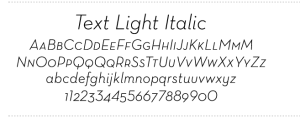
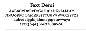
These are versions of a font called Neutraface. Look familiar? They should. The Neutraface font family was introduced in 2002 and has increased in popularity every year since then, with 2009 being some kind of tipping point. Now you see it everywhere. Here’s an ad currently running for Wells Fargo:

That’s Neutraface slab in Roman and italic. Here’s AT&T Wireless:

Neutraface demi text italic.

Between these two brands alone, Neutraface probably has north of $200 million behind it.

Why am I geeking out about a typeface? Because type is one of those unseen forces that shape fashion in graphic design and advertising. Back in December, I wrote about how it is that ads wind up looking like other ads, often in unrelated categories to different audiences. I touched on factors as lofty as parallel evolution and as banal as common thievery and client dictate. But the fourth factor, which I called “something in the water,” I left for a later post. Well, type is something in the water. You toss it in, everyone drinks it and in a couple of years, art directors everywhere are showing the symptoms.

Color is another unseen hand. Every year Pantone and a few other influencers decide what the on-trend colors for the next year will be and everyone from fashion designers to paint manufacturers to designers take a swig. Here’s this year’s color, by the way:

Honeysuckle. Bet you didn’t see that one coming. But now that you know, keep your eye peeled. You’ll be amazed how often you see it.

A last thought on this subject (for now): how many adjoining boxes containing type, background colors and artwork did you see in ads before Quark, with its text and picture boxes, appeared in the mid-90s?

Where the wild type treatments are.


One is for rebellious children of all ages.
The other one is for…rebellious children of all ages.

What makes an ad look old?

I was leafing through Penthouse while getting my hair cut and…

Wait. It’s not what you think. It was the April 1974 issue of Penthouse, part of a big moldy stack my trendy barbershop found and keeps on hand. As a sociological artifact it was fascinating, on a lot of counts, most of which are not appropriate to discuss in a family blog.

Being the focused adman I am, I skipped right by Miss April, the Penthouse Forum and other appeals to my baser instincts, and focused on the ads. They seemed older–far older–than their 35 years, and I tried to figure out why. One obvious reason is that most of them were for cigarettes, but cigarette advertising wasn’t banned until relatively recently, so that wasn’t it.

There was the grainy, dirty quality of the photo reproduction–but now that look is slavishly recreated for its retro appeal. Ditto the haircuts and outfits (and ‘staches on the guys).

ThenI realized what it was that dated those ads as surely as carbon dates rock: the typography.

Windsor. Remember Windsor? Sam Scali used it for Perdue then everybody got on board.
And Avant Garde. Lots of Avant Garde Extra Bold. Which now looks very not avant garde. And everything tracked super-tight so all the letters touched and the kerned characters got so intertwined they were almost x-rated.

I stared at that type and got a whiff of antiquity. Which is ironic because a few weeks before, I had been in Rome and while walking through the Coliseum, I had admired all the, um, Roman type chiseled into the ancient stone and thought, 2000 years later, that it looked remarkably fresh.