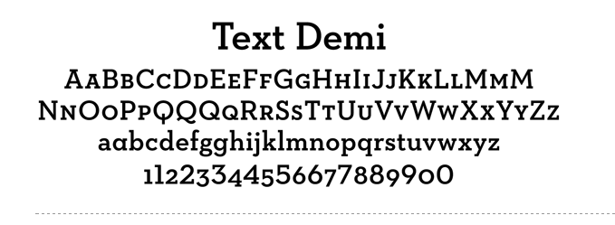
These are versions of a font called Neutraface. Look familiar? They should. The Neutraface font family was introduced in 2002 and has increased in popularity every year since then, with 2009 being some kind of tipping point. Now you see it everywhere. Here’s an ad currently running for Wells Fargo:
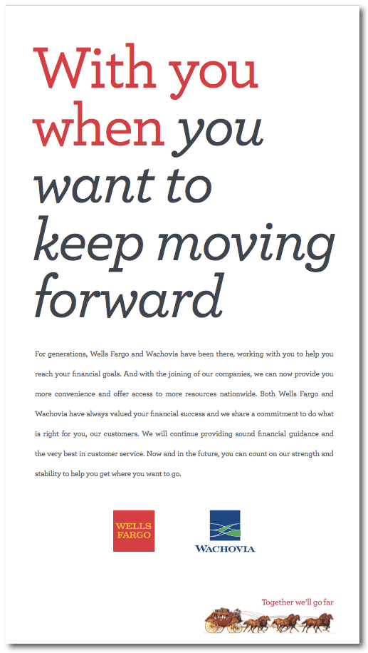
That’s Neutraface slab in Roman and italic. Here’s AT&T Wireless:

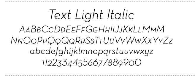
Neutraface demi text italic.
Between these two brands alone, Neutraface probably has north of $200 million behind it.
Why am I geeking out about a typeface? Because type is one of those unseen forces that shape fashion in graphic design and advertising. Back in December, I wrote about how it is that ads wind up looking like other ads, often in unrelated categories to different audiences. I touched on factors as lofty as parallel evolution and as banal as common thievery and client dictate. But the fourth factor, which I called “something in the water,” I left for a later post. Well, type is something in the water. You toss it in, everyone drinks it and in a couple of years, art directors everywhere are showing the symptoms.
Color is another unseen hand. Every year Pantone and a few other influencers decide what the on-trend colors for the next year will be and everyone from fashion designers to paint manufacturers to designers take a swig. Here’s this year’s color, by the way:
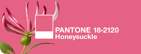
Honeysuckle. Bet you didn’t see that one coming. But now that you know, keep your eye peeled. You’ll be amazed how often you see it.
A last thought on this subject (for now): how many adjoining boxes containing type, background colors and artwork did you see in ads before Quark, with its text and picture boxes, appeared in the mid-90s?
