Category Archives: zeitgeist

We have only ourselves to blame.

When the going gets weird, the weird go pro.

–Hunter S. Thompson


Ad people are a pretty left-leaning bunch (the great Hal Riney and a few others being notable exceptions) and that certainly describes me. So like my fellow progressives, I’ve been in a self-pitying sulk since last Tuesday night. Staying off Daily Kos and Talking Points Memo for a week freed up some think time, and since this is a dead siteblog focusing on advertising, these thoughts are addressed to my colleagues:

Stop blaming Comey.

Stop blaming Bernie.

Stop blaming Millenials.

Stop blaming the media.

And most of all, stop blaming people with different values and different cultural reference points than yours.

You’ve all sat in enough focus groups and “ethnography” studies to know America isn’t Billyburg or even Hoboken.

You know–because you’ve told your clients this in defense of your craft–that emotions guide decision-making, not reason.

You were taught—or should have been if you weren’t—that before a customer can care about what you know, he needs to know whether or not you care.

The Democratic campaign leadership failed on all these counts. They wrote off an enormous swath of the voting public as Flyover Zone yahoos: too dumb, too ill-informed, too bigoted and too Jesus-loving to bother with.

And only after the damage was done, did they consider the possibility that some of those yahoos might have voted for Hilary if they were accorded just a smidgen of respect and attention.

Progressives—and I’m assuming at my peril that means most of my advertising cohort–were appalled at the alternate universe of Trump supporters: an echo chamber of true believers reinforcing and validating each others’ views.

The irony, of course, is that the exact same could be said of our own liberal bubble. Confident in our enlightened perspective and superior grasp of the facts, we commiserate with each other online and express our wonderment over this turn of events. We need to spend less time on HuffPo and more time with real people unlike ourselves if we’re ever to get our heads out of our collective asses and turn this thing around.

Remember the Maslow hierarchy from Psych 101? Let me jog your memory:maslowshierarchyofneeds-svg

Basic, primitive needs come first. That’s how we’re wired. When the crappy, highly processed cereal filled with government-subsidized corn and sugar is $2 a box and the locally produced, GMO-free granola is $8 and I’m making $10.25 an hour, I don’t want to be lectured about healthy eating. I may or may not be willing to support gay marriage, or welcome immigrants, or keep crazy people away from guns. I may be open to understanding and accepting the validity of other people’s religious beliefs.

But right now, I got other shit to think about, OK?

That’s what we lefties always get wrong. We’re always assuming the issues we’re passionate about—equality, inclusion, personal growth, the environment—should be everybody’s top priority. But all those issues fit into the tiny blue triangle of self-actualization at the top of Maslow’s pyramid. The rest, a giant submerged iceberg of hurt and need, is what the Democratic campaign ran into and then sank.

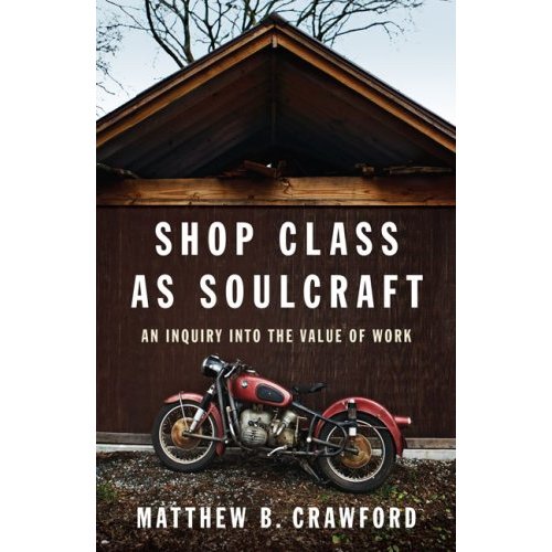
Here are two books that I highly recommend to fellow coastal and urban progressives and to advertising people in particular. In them you’ll find a more nuanced and more empathetic portrayal of people who live in a very different world than ours, but who are nonetheless recognizably human.
shopclassassoulcraft

deer_hunting_jesus_lr


Tagged

Antisocial Media.

HGS001


This ad, which appears in the current issue of Maine North Woods Sporting Journal, is a rich treasure-trove of insight into rural America. In a space 2×3 inches, there’s enough material for at least 2 doctoral dissertations plus a #1 country song.

“Guns. Wedding Gowns. Cold Beer.” Yup…that about covers it. Anything else you can kill, whittle or borrow from a buddy.

While the accompanying photo shows only the first of these 3 essential categories, it takes little imagination to figure out how the other two come into play.

Is the ad’s writer riffing on us? Is he or she in on the joke?  If  “We ain’t got it, you don’t need it!” showed up in a faux-redneck ad for LL Bean or Carhartt, it would be Gold Pencil material. In a cabin in Maine way off the grid, lit by propane lantern, this ad’s irony-free, defiant pedigree is more apparent.

 For a brilliant portrait of the lives this ad reflects, read Joe Bageant’s  “Deer Hunting with Jesus.”  Propane reading light is optional.

Tagged , , ,

What the 10021% thought about the Super Bowl ads.

“The last national audience.” “The biggest stage.” Whatever you want to call it, at 113 million viewers, the Superbowl audience means lowest-common-denominator targeting for advertisers.

Except for groups like the one gathered to view the game in the Grill Room of a posh New York private club to which I have inexplicably been granted membership. These people are for the most part rich, powerful and accomplished, and/or artists, writers or musicians of note. Zip Code 10021 is their habitat, and 65 is the average age.

An unscientific sample of 50 of these fellow club members and their spouses/SOs yielded the following results:

Favorite commercial: Skechers “Mr. Quiggly”

Runners-up: A tie for 2nd between the Budweiser “Clydesdales” and Doritos “Sling.” “Mrs. Brown” for M&Ms came in 3rd.

Most disliked: A tie between Budweiser “Platinum” and Audi’s “So long, Vampires.”

In general, commercials that hid the identity of the brand until well into the spot did not fare well. “You can’t tell who it’s for!” was a common complaint. That was a little unnerving to hear, since I’ve come to believe over time that telling people how the movie ends in the opening scene rarely works well.

The spots that did well with this group hewed to Super Bowl commercial orthodoxy: animals, characters and humor. Having said that, I was surprised to see how little an impression the Coke polar bear spots made.

The big negatives racked up by the Bud Light Platinum launch spot puzzled me, since to me the spot was so lame it lacked the ability to either impress or annoy. I guess telling people who already drink “top shelf” adult beverages that Bud Light is now part of their consideration set is a little off-putting.

But the dislike of the Audi “Vampire” commercial came as no surprise. It was a very long run (the destruction of a vampire party) for a very short slide (daylight headlights, get it?), populated by people who look like fanged versions of the Club members’ own offspring—not the core target for this auto maker.

In my view, “So long, Vampires” is smack dab in the death quadrant of the Belly of the Beast Suckage matrix: expensive and bad. At least on this question, I find myself squarely in the 10021%.

Tagged ,

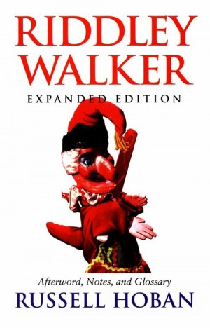
R.I.P. Russell Hoban 1925-2011

War hero, illustrator, children’s book writer and the author of the best novel pretty much no one has ever read: Riddley Walker. Trubba not, Mr. Hoban.

Tagged ,

Something in the water.

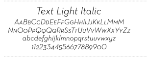
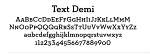
These are versions of a font called Neutraface. Look familiar? They should. The Neutraface font family was introduced in 2002 and has increased in popularity every year since then, with 2009 being some kind of tipping point. Now you see it everywhere. Here’s an ad currently running for Wells Fargo:

That’s Neutraface slab in Roman and italic. Here’s AT&T Wireless:

Neutraface demi text italic.

Between these two brands alone, Neutraface probably has north of $200 million behind it.

Why am I geeking out about a typeface? Because type is one of those unseen forces that shape fashion in graphic design and advertising. Back in December, I wrote about how it is that ads wind up looking like other ads, often in unrelated categories to different audiences. I touched on factors as lofty as parallel evolution and as banal as common thievery and client dictate. But the fourth factor, which I called “something in the water,” I left for a later post. Well, type is something in the water. You toss it in, everyone drinks it and in a couple of years, art directors everywhere are showing the symptoms.

Color is another unseen hand. Every year Pantone and a few other influencers decide what the on-trend colors for the next year will be and everyone from fashion designers to paint manufacturers to designers take a swig. Here’s this year’s color, by the way:

Honeysuckle. Bet you didn’t see that one coming. But now that you know, keep your eye peeled. You’ll be amazed how often you see it.

A last thought on this subject (for now): how many adjoining boxes containing type, background colors and artwork did you see in ads before Quark, with its text and picture boxes, appeared in the mid-90s?