The Bachman Effect.

How stupid should advertising be to accurately reflect and connect with its target?

Depends on who you ask. David Ogilvy famously wrote, “the customer isn’t stupid. She’s your mother.” Well, we’re not going to touch that one.

In many categories, the rule of thumb is to write to a sixth-grade education. I can live with that. Sixth graders know all sorts of facts, some useful and some not. U.S. history is pretty fresh in their heads, and the kids not stuck in Kansas or some compound in Utah know about evolution. More importantly, they are at an age where they are beginning to understand the adult world and its rules are not what they seem. Their BS meter is on high alert.

Yeah, I wouldn’t mind making ads for sixth graders. What I do mind is writing ads for people who forgot everything they knew in sixth grade, and are damn proud of it because it frees them to make shit up, or—if that requires too much mental effort—believe without a moment’s hesitation the shit other people make up.

Which brings me to Michelle Bachman, the jesterU.S. Representative from Minnesota. Gail Collins accurately characterized her a few weeks ago as, essentially, Tracy Flick hit by the stoopid stick. I don’t want to go into a long recitation of her lies, malapropisms and shaky grasp of historical fact. This is an advertising blog, after all. So let me bring this back to the subject at hand.

Are we making ads for people for people so fucking stupid, they think Michelle Bachman has something useful to say? If so, can we rock it Bachman-style and just make crazy claims and accusations?

Here’s one:

Tide’s bulls-eye design is a secret Al Quaeda missile-targeting program. Buy Gain instead and fight terrorism.


Or how about this:

Ten out of 12 signers of the Constitution preferred Pappa John’s pizza to Dominos. Pappa John: the Founding Pappa pizza.

I don’t think Fox would have a problem with either of these, do you? And if other networks’ Clearance departments have a problem, perhaps we can ask them why they see Michelle Bachman’s lie-strewn diatribes as “news” and make no effort to fact-check?
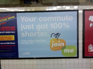
Coincidence or rip-off?


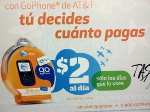
These two ads were 50 feet apart in the 68th Street station on the #6 subway station. Besides both being tagged by a certain Mr. “Tasty,” they share the use of overlapping color layers containing reversed-out white type. The layers themselves are similar organic, rounded semi-blobs. The resemblance, at least to people who ponder art direction in public places, is startling.

And for clients, vexing. Like furious socialites at a charity event who show up rocking the same expensive couture frock as a competitor, at least one if not two CMOs are asking their agency WTF?

Well, WTF usually has one of four possible answers. Here they are:

1. Parallel evolution. Subject different designs to the same evolutionary forces and demands, and they will evolve similar solutions. The classic example used to illustrate this phenomenon is the similar shape of sharks, dolphins and F-15 fighter planes. Fish, mammal, machine, all evolved to be able to hunt, track and kill moving at high speed through a resistant medium.

In the advertising world, parallel evolution means: give reasonably competent creative teams working on different brands the same brief, stuffed with the same “insights” from asking the same questions to the same focus groups in Paramus, subject their work to the same testing methodology, and you will get more or less the same results, arrived at independently, no copying involved.

That’s why you typically see this type of imitation in work within the same category, and usually in a category where there’s a lot of research and testing. It’s why you’ll see four different campaigns for diabetes products, all of which have people in the ads saying “I took control.” Listen to enough patients suffering from diabetes say “I don’t feel in control of my life” and that’s what happens.

2. Agency-driven imitation. This is an ugly subject but ripoffs happen.Walk down the halls of any large agency creative department and you will see someone feverishly flipping through recent One Show and CA annuals looking for “inspiration.” The thinking usually runs along the line of, Well this ad won an award for a mountain bike brand. If I use it for my small regional BtoB office supply account, what’s the harm?
Besides which, we changed the original Franklin Gothic to Meta Bold!

This is not good, but it has its evil counterpart in reason number three:

3. Client-driven imitation. If you haven’t been in a situation where a client has said to you, “Give me something just like that Old Spice guy on the horse,” you haven’t been in the business long enough. Rough-around-the-edges clients who didn’t go to corporate finishing school or who are so senior or so rich they don’t give a shit, will tell it to you that blatantly. The MBA types are a little more subtle: they’ll send you a link or a clip of ad they like. They’ll causally drop a reference to the fact that their boss, or their boss’s boss, thinks the new Snickers campaign is great, and if the next round of work doesn’t show the product logo being used in a playful, iconic way, they” drop another hint. Eventually, someone in agency management will dope-slap the creative team and the imitative campaign will be dutifully presented…and bought.

4. Something in the water. The last reason similar ads, or similar approaches to graphic design problems crop up has nothing to do with anything as obvious as the desire to copy or moving with the herd. It is something more mysterious, more ineffable and–because it doesn’t just affect advertising but also fashion, art and science, much more interesting. Interesting enough to deserve its own post, which hopefully will appear soon.

I heard you the first time.

In the first commercial break after start of play in last night’s Giants-Vikings game, a new commercial from Chrysler was shown in 3 of the 6 slots.

Is that the “no matter how long your piss break is, you’re gonna see this spot” media strategy? Kind of like a roadblock buy, but a urethra-block instead?

Jesus, people, do your homework: viewers don’t leave a game until the 4th quarter or unless it’s a blowout. They’ll see your spot! And if you have that much money to burn on the buy, do all the agency creatives, producers, gaffers, grips and post houses a favor: shoot a 2nd spot.

It’s not the assignment. It’s what you do with it.

I was going to post about the unbelievably annoying Quiznos spot, but that would just be spreading garbage around, not confining or destroying it as it warrants.

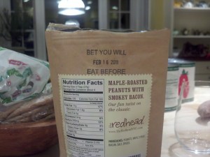
Instead, a shout-out to a little bit of loveliness:

While creatives whinge about the confines put upon them for their next million-dollar campaign, someone—maybe a package designer, maybe a freelancer, maybe a waiter at Redhead—saw a way to take the humble “Use by…” freshness-dating requirement and turn it into a totally unexpected delight.

Of time, salt, and the power of randomness.

I read foodie magazines and this month they all have ads for Morton Mediterranean Sea Salt, the Morton people being no fools and also readers of the same titles they advertise in. So they’re getting with the program, keeping their brand on trend, etc. etc.

The ads are neither good nor bad, just workman-like expressions of the carefully calculated marketing strategy that informed them. They carry a whiff of focus groups reacting to mood boards full of Tuscan revelry, picnics in the vineyards, whitewashed seaside villas, figs and olives.

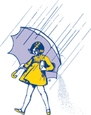
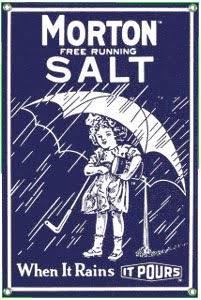
One thing they never could have focus-grouped their way to, however, was the Morton icon, the 100-year old little girl in the rain with her umbrella and her freely-flowing salt.

When it rains it pours. That sounds so lovely, doesn’t it? Like Emily Dickinson meets Peggy Olson.

The parallel “it”s, the riff on an old saying (old even in 1890), the succinct expression of product difference (Morton invented the process to keep table salt from caking in humid weather). It’s so…good.

But if the Morton girl and her tagline were not an accident of history, beloved and beyond harm from change-agent CMOs and the Peter Arnells of the world, could she be created now? What brief could lead a creative team to this girl, too young to be the purchaser, outside in the rain away from kitchen and cupboard, carelessly wasting the product as she walks?

This, I believe, is what Mark Fenske meant when he wrote “Nobody ever did a good ad by writing to the strategy.” Strategies are rational; focus groups, absurdly so. The little girl, carrying her mother’s purchase home upside down as little girls do (or did, when the store was down the block instead of at the mall, and children were still allowed to go do errands without an adult riding shotgun), splashing happily in the rain: she is not the product of rational process. She and the other random happy hand-me-downs of brand history are a precious gift.

That rarest of things: a good banner ad

Instead of a takeover, a dripover. Much more interesting, much less intrusive.

10 Ads I don’t want to see in #-D

With 3-D TVs already in stores at prices that are hurtling down towards the magic $1000 level, it’s time to think about the implications for advertising. 3-D opens up new vistas for product demos, sexual come-ons and intrusive spokespeople you didn’t want in your living room even when they were flat. Here, for example, are 10 spots I’m glad were made in the pre-3-D era and which I hope never return dimensionally enhanced:

1. Calvin Klein underwear. TMI times 3.

2. Olive Garden. Looks disgusting already.

3. Mohegan Sun. At least now I can look away.

4. Cialis. Ew.

5. Charmin. Too close for comfort.

6. Carl Paladino for Governor. Don’t tase me, bro!

7. Carnival Cruise Lines. No escape.

8. Mucinex. The stuff of nightmares.

9. Lysol Toilet Bowl Cleaner. Not going down that hole.

10. Progressive Insurance. Surround-Flo would be overwhelming.

“So that’s what occasional irregularity looks like.”

Adventures in ad placement, cont’d.

Seen in the Scottish Highlands. Maybe not the best place to advertise a thrilling adventure ride in a tricked-out Land Rover, laddies.

Please familiarize yourself with the safety information in the following commercial.

The new Delta campaign from Weiden & Kennedy is shot in docu-black and white, so you know it’s serious.

Serious as a heart attack, actually. I don’t have a transcript of the actual copy, but here’s what I remember: after posing the rhetorical question “What does it take to fly?” (violating Feinberg’s rule of never starting a conversation with a disinterested party by asking a fake question), the VO goes on to say something like you have to head into the wind, or you won’t be able to generate enough lift to take off. And we see someone who’s clearly a flight instructor making the point to a nervous-looking newbie pilot.

Now, being a writer of copy, I know this whole thing is just a big, winged metaphor for the newly-merged Delta/Northwest entity fearlessly facing stiff economic headwinds and embracing change. I get it, I get it. I don’t care, but I get it.

Still. I was on a plane going to Scotland from JFK last week, waiting our turn to take off, and all I could think was, Are we facing into the wind? What if we’re not? Did I pack too much shit in my duffle? Is my life insurance paid up? How cold is Jamaica Bay this time of year?

This is not what you want your flying public thinking about with your, um, launch spot. And the theme line—“Keep climbing.” Sweet Jesus! Who wants to hear that snatch of cockpit chatter?

Climb! Climb, dammit!

My life in pictures


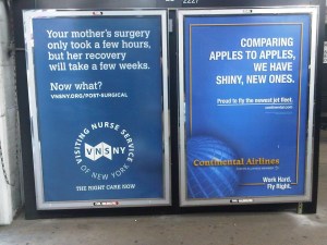
Two campaigns I’m intimately involved with, one now and one back in the day, cohabiting the same transit billboard.

To the reasonable question, “Can’t you do anything that doesn’t have a blue background and big headline-as-art?” the answer is yes, but I agree you wouldn’t know it from this, er, mini-portfolio.

Thanks to Peter Hubbel for noticing and capturing.