What the 10021% thought about the Super Bowl ads.

“The last national audience.” “The biggest stage.” Whatever you want to call it, at 113 million viewers, the Superbowl audience means lowest-common-denominator targeting for advertisers.

Except for groups like the one gathered to view the game in the Grill Room of a posh New York private club to which I have inexplicably been granted membership. These people are for the most part rich, powerful and accomplished, and/or artists, writers or musicians of note. Zip Code 10021 is their habitat, and 65 is the average age.

An unscientific sample of 50 of these fellow club members and their spouses/SOs yielded the following results:

Favorite commercial: Skechers “Mr. Quiggly”

Runners-up: A tie for 2nd between the Budweiser “Clydesdales” and Doritos “Sling.” “Mrs. Brown” for M&Ms came in 3rd.

Most disliked: A tie between Budweiser “Platinum” and Audi’s “So long, Vampires.”

In general, commercials that hid the identity of the brand until well into the spot did not fare well. “You can’t tell who it’s for!” was a common complaint. That was a little unnerving to hear, since I’ve come to believe over time that telling people how the movie ends in the opening scene rarely works well.

The spots that did well with this group hewed to Super Bowl commercial orthodoxy: animals, characters and humor. Having said that, I was surprised to see how little an impression the Coke polar bear spots made.

The big negatives racked up by the Bud Light Platinum launch spot puzzled me, since to me the spot was so lame it lacked the ability to either impress or annoy. I guess telling people who already drink “top shelf” adult beverages that Bud Light is now part of their consideration set is a little off-putting.

But the dislike of the Audi “Vampire” commercial came as no surprise. It was a very long run (the destruction of a vampire party) for a very short slide (daylight headlights, get it?), populated by people who look like fanged versions of the Club members’ own offspring—not the core target for this auto maker.

In my view, “So long, Vampires” is smack dab in the death quadrant of the Belly of the Beast Suckage matrix: expensive and bad. At least on this question, I find myself squarely in the 10021%.


Tagged ,

Apple iPhone 4S, Day 1

Today is the first fully operational day with my new iPhone after 16 months with the DroidX. (Verizon Wireless  did their deal with Apple 3 months after I broke down and got the Droid. I was going to be damned if I was going to fork over an additional 400 bucks to skip to the head of the line).

Seeing as how half the spots on the upcoming Big Game (which is what advertisers call the Super Bowl when they’re too cheap to buy the usage rights from the NFL) will feature bright young people peering rapturously into screens, I thought I’d give a long-time Apple but short-time smartphone user’s perspective, with the Motorola DroidX as my frame of reference (yes, I had a Palm first but we won’t talk about that).

The screen’s smaller than the Droid’s but brighter. It seems like it’s higher resolution, too, but that may just be a better interface. I liked looking at photos better on the Droid. I like managing and importing them better on the iPhone.

Adding is easy. Deleting is a problem. Like a digital Roach Motel, stuff that goes into an 1Phone won’t come out. When I synched the phone with my iPhoto library, I let it suck up the whole library, assuming I could just nuke the dupes and shots I didn’t like from the phone’s photo gallery.

No.

In what seems to me to be a fatally stupid quirk, I have to go back to iPhoto (which is not my default photo library because I use Adobe Bridge/Photoshop) on the comp, create a new file of just shots I want for my phone, and re-sync. Excuse me Apple, but that’s some Microsoft Zune shit right there.

Same issue with music. And with home page icons. With the Droid, you just selected an icon and held your finger down till it glowed as red as an Iranian reactor, then dragged it to the Trash. Easy.

It’s true what they say. There are better apps for the iPhone. Didn’t realize what a B-lister I was till I wandered around the App Store and saw what I was missing. Big big difference.

The camera is amazing. There is simply no need for a dedicated point-and-shoot camera anymore. Save your SureShot until it reaches the Lomography-retro-chic zone.

Siri is not too bright. And not nearly as sexy-sounding as the Emma Peel-wannabe voice on the old TomTom GPS.

iPhone cases are stoopid. Except for the one I’m getting on Etsy:

All walnut all the time

Tagged , , , , ,

Stop trying to make “Egg McMuffin” happen.


Like the hapless Gretchen in Mean Girls who wanted nothing more in life than to create a word meme that would take hold with her cohort, McDonalds has run into the ruthless buzzsaw of reality with its widely ridiculed spot:

Making your brand name (or variant thereof) part of everyday language is a quest with a long history, a few successes  (“Fedex it”) and some spectacular failures, like this epic Florence Henderson spot from the 70s:

This approach reached its nadir in the 80s with Jordan Case McGrath, whose Jim Jordan was a proponent of “nameonics” (which is not only idiotic sounding but also a play on the word “mnemonics”–a reference that nobody but a dork like me would know, or should). During nameonics’ brief, disgraceful reign, we got classics like “Deer Park, that’s good water!” and “Renuzit Doozit.”

The rise of social media seems to be prompting a nameonics resurrection, as advertisers try to “go viral.” But it’s not a good idea, as it was not a good idea 30 years ago, and for the same reason: an advertiser may own his brand, but the people own the language. Come up with a branded product or service that’s so unique and indispensable that there is no synonym for it, and the people will add it to the vocabulary with no prompting necessary.

Don’t believe me? Google it for yourself.


Tagged , , , ,

Ghosts in the machine.

Ads, like haircuts and predictions, are prone to looking bad when the world changes in unanticipated ways, which is to say: constantly. The saving grace for ads was always their impermanence.

To everyone except for archivists or hipsters leafing through old issues of Playboy waiting their turn in the chair at Freeman’s Barbershop, ads cease to exist when they stop running. This is a mercy when you have created ads that guilt-tripped women for making bad coffee for their hubbies; or announced the arrival of picturephones prematurely (twice). Unless you stupidly cop to the act in a blog (D’oh!), you can escape history’s judgment.

Not so now. The ease of search and the speed of change make instant and highly visible jokes out of web sites, apps and the other trappings of online marketing. They are ghosts in the machine, orphaned by change.

Here are some of my favorites:

They pulled the product in 6 weeks. The page endures.

You can surf the site. You just can't buy the car.

Seems to be lacking a tab for "hateful diatribes."

I like the "Stay up to date with Michele" part.

Tagged , , , ,

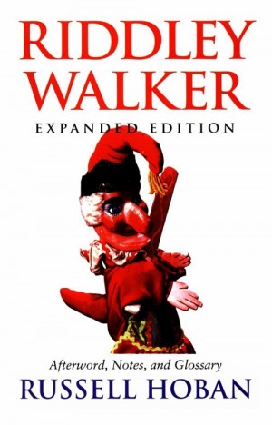
R.I.P. Russell Hoban 1925-2011

War hero, illustrator, children’s book writer and the author of the best novel pretty much no one has ever read: Riddley Walker. Trubba not, Mr. Hoban.

Tagged ,

All the way to…6?

FCC tells advertisers to CALM down, lowers the volume on commercial breaks — Engadget.

In yet another sign of the encroaching Big Brother Nanny State, the FCC has decided Americans are not capable of adjusting their TV’s volume controls up and down 32 times in a given Fox Sunday football game.  Starting next December, commercials in the U.S. will no longer allowed be allowed to exceed the volume of the broadcasts they interrupt.

As someone who is 2 AAA batteries short of home theater mastery, needing to hop up from the couch to put the muzzle on the Bud Light announcer and then hop up again 3 minutes later to jack the volume so I can hear the play-by-play, I can’t wait until next December. As someone who gets paid to make my advertising clients happy, I’m a little more conflicted.

Rare is the client who, at the audio mix session, doesn’t think it should be louder even when we’ve already “pinned the needle”–that is, made it as loud as it can be without risking distortion during broadcast. And, noxious as that seems, there is at least some evidence that says going all the way to 11 is smart marketing.

Speaking of going to 11, I’ve found out the hard way that many people in their 20s and 30s have never seen Spinal Tap. See it. See it tonight. And in the meantime, here’s the relevant clip:

"It's one more louder."

Like the roadies who rigged Nigel Tufnel’s Marshall amp with a volume control that went to 11, just to stop him from whinging about insufficient loudness, audio engineers in our biz have developed scamscoping mechanisms to make clients happy: playing tracks through monstrous speakers, fiddling with controls without actually boosting the levels…hey, you do what you gotta do.  But their problems, and by extension, the industry’s, will be that much worse next year. My clients, being largely in healthcare, are an appropriately subdued lot. But what if your client is Coors Light? What do you do when you’re legally barred from being any louder than Troy Aikman?

Here’s a suggestion: go for contrast. Trying to outshout meatheads on sportscasts or reality-TV shows is futile. Buy quiet shows. Nature programs. Televised Mass. News Hour with Jim Lehrer. David Brooks is the loudest voice on that show, around a 6 on Nigel’s amp. Mix to that level and you’ll sound like Crazy Eddie when your spots comes on next year.

Tagged , ,

How do you know if you’ve made a good ad?

Ever try to saw a straight line? I don’t mean hacksawing a curtain rod to fit your window.  I mean straight: true, plumb and parallel on both sides of the cut.

The practice cuts you see above, in all their imperfect glory, were not made by a newbie. They were made by a professional woodworker working with a sharp saw. His name is Joel, and he writes a nice blog that lives in an addictively readable website for a very cool maker of hand woodworking tools in Brooklyn called Gramercy Tools. He was documenting the process of relearning this basic skill with his workspace set up in a new way.

I count 15 cuts. Some of them are skewed. Some wander off the path. Some are OK. The last one is true from any angle and was made without following a guide. Do that with your next ad assignment and not only will you wind up with a good ad, you’ll know it.

A parting koan from Joel the woodworking sensei:

 …the more I practice the less scared I am of screwing up, and then I don’t screw up. 

Tagged , , ,

Occupy the storefront!

It was just a matter of time.

The folks at FishsEddy demonstrate how the 99% can become the 1% through the clever use of new cultural memes.

The handpainted headlines are an appropriate (and cheap) typography solution.

Tagged , , ,

If politicians were pills.

The recent uproar over Mitt Romney’s TV spot in which he shows a clip of Barack Obama saying “If we keep talking about the economy, we’re going to lose” without mentioning that Obama was actually quoting John McCain got me fulminatingthinking.

I mean, in the real advertising world, you can’t do an ad that says the sun will rise in the East without an affidavit from an astronomer and even then you have to stick in the word “probably.” And if you’re doing an ad for a prescription drug, you then have to spend 30 seconds warning people about the perils of sunshine.

That, my friends, is the difference between “commercial speech” and “political speech.” The former has to be more or less true, the latter has to be no more than 30 seconds long. Section 315 of the Communications Act specifically requires broadcasters to carry all political advertisements regardless of their truthfulness:

… If any licensee shall permit any person who is a legally qualified candidate for any public office to use a broadcasting station, he shall afford equal opportunities to all other such candidates for that office in the use of such broadcasting station: Provided, That such licensee shall have no power of censorship over the material broadcast under the provisions of this section.

Why did Congress make political advertising a truth-free zone? Something to do with not wanting government to be deciding what is and isn’t true in a candidate’s statements. The government can decide if you’re telling the truth about a nail fungus treatment, but can’t prevent you from lying about issues affecting the wellbeing and future of our country.

But we can dream, can’t we? Let’s imagine candidates were subject to the same advertising rules as prescription drugs. Why not? They all promise relief from life’s miseries. Rick Perry could be Viagra. Mitt Romney? Lipitor. Obama: Xanax.

So many political ads are churned out in the course of a campaign, it would be tough to run them all through the same heavy fact-check and legal gantlet real pharma ads go through. Let’s just focus on the fair-balance copy every spot would have to include:

(Name of candidate) is not for everyone.

Side effects include nausea, itchiness, regret and outrage.

Some people experience homicidal impulses, hysterical laughter or a strong desire to shower when exposed to (name of candidate) for long periods.

If you experience any of these symptoms, ask yourself whether (name of candidate) is right for you.

The Suckage Matrix

Watching cable channels like Bravo and TBS means being treated to a crazy mishmash of expensive national spots and low-rent local ads in every commercial break pod.

Glossy effects-rich corporate anthems alternate with messages from local nail spas and rug stores shot on a Flip and edited on iMovie. Aspect ratios stretch and shrink like cheap suits: too wide, too narrow, not enough letterbox or too much.

It’s entertaining the way a good downtown street is entertaining: bodegas and chic restaurants, hardware stores and glam boutiques are all in the mix.

But this collision of high and low commerce also underscores the sad fact that budget doesn’t correlate to goodness. Let’s construct a suckage matrix:

The Suckage Matrix

The best place to be, of course, is in the upper-right quadrant: great advertising that costs virtually nothing to make. Google’s Parisian Love spot is a fine example.

The upper-left quadrant, bad advertising that was made on the cheap, isn’t fun to watch (or produce) but it’s not a surprise and—viewed strictly as a business decision– it’s not a disgrace. If it works, great; if not, no biggie.

Good advertising that costs a lot of money to make–the lower right quadrant– is simply what one would expect when you give a lot of creative talent the resources to realize their idea.  BBDO built a global agency almost entirely in this quadrant: making pretty good and occasionally terrific big-budget TV spots for Fedex, GE and Pepsi.

And then there’s the death quadrant: bad advertising that cost a fortune to make. You see less of it than you used to, partly because no one has any money and partly because of the internet. But occasionally you see something that just takes your breath away as you watch millions of dollars go up in sooty, stinky smoke.

Such is the new TransAmerica campaign. If you haven’t seen it, please, please do. I can’t really do justice to all its expensive, CGI suckage.  It includes humongous gears, a conveniently deceased husband, a yellow cottage and something about pyramids. Oh—and a girl who sings a treacly bit of “Tomorrow” from the musical “Annie.” Really.

To understand how something like this could get conceived, let alone presented, sold, produced and aired, it’s instructive to read the Adweek puff piece that ran the week the campaign debuted.

The underlying theme of the article is that life insurance is really fucking boring and so the agency creatives had to challenge themselves to find a way to make it less boring. Translation: “This shit doesn’t interest us because we’re 32 years old and we’re going to live forever. But really big gears could be cool.”

Exactly. But that still leaves the question of how on earth JWT sold this nonsense to the client. The answer lies in this bit of helpful reportage: “Each ad uses special effects to literally get under the roof of Transamerica’s iconic ‘Pyramid’ building in San Francisco…”

In other words, the agency convinced the client these ads “leveraged his brand equity.” Except for one thing:

You don’t know you’re in the “Pyramid” building because the pyramid doesn’t appear until the last 2 seconds.

 So this entire hellish life-as-a-giant-factory-assembly-line metaphor unfolds with zero context and zero explanation.  Makes the eyebrow-threading spot that followed it that night look pretty, pretty good.